Menus You Never Have to Think About
The best menu is the one the player forgets the moment they leave it. Getting there takes more discipline than most teams budget for.
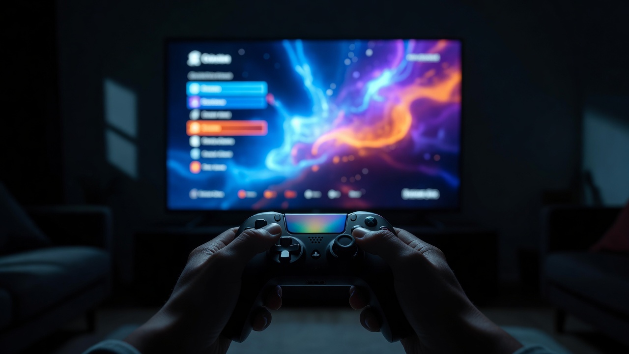
Design for the thumb, not the cursor
Most menu problems we see on review calls come from one root cause: the menu was designed with a mouse in mind and then ported to a gamepad. A mouse can jump anywhere; a d-pad moves one step at a time. That means layout is navigation. If pressing right from the "Audio" tab lands on an unexpected slider three rows down, players feel lost even if every label is perfectly legible.
Build menus as a grid of focusable items with predictable neighbours. Up, down, left and right should always go where the eye expects. Wrap-around at the end of a list is fine for short lists and annoying for long ones. Remember where focus was when the player backs out and returns: nothing is more tiresome than re-scrolling a list of forty graphics options.
Focus states that shout
On a TV across the room, a subtle hover tint disappears. A focused item needs at least two signals: a change in colour or contrast plus a change in shape, such as a frame, an underline, a scale-up or an arrow marker. Colour alone fails for players with colour vision deficiencies, which is why both the Game Accessibility Guidelines and the Xbox Accessibility Guidelines warn against conveying information with colour only.
Button prompts and platform glyphs
A prompt like "Press [A] to confirm" is typography too. Studios keep libraries of platform glyphs for Xbox, PlayStation, Nintendo Switch and keyboard, and swap them automatically based on the last input device the player touched. Mixing glyph sets is a certification issue on consoles and a trust issue everywhere else.
Confirm and cancel also carry history. For years PlayStation games in Japan used circle to confirm while Western releases used cross; with the PlayStation 5, Sony standardised cross as confirm worldwide. Nintendo platforms place confirm on the right-hand face button. If your game targets several platforms, follow each system's convention and let players remap anyway.
Safe areas and distance
Televisions can crop the edges of the image, and handhelds have rounded corners or notches. Keep critical text inside a title-safe area, traditionally around the inner 90 percent of the screen, and offer a HUD or UI margin slider so players can pull content inward. Then think about viewing distance: a 1080p menu on a 55-inch TV seen from three metres is effectively smaller than the same menu on a handheld held at arm's length. Text size options are not a luxury.
Plan for text that grows
English is short. German and French strings commonly run 20 to 35 percent longer, and a two-letter Chinese label might become a full word in Finnish. Lock fixed-width buttons early and you will be truncating "Einstellungen" for the rest of production. Design containers that expand, allow two-line labels, and give localisation teams a preview tool so they can see their text in context rather than in a spreadsheet.
Style without the friction
Stylised menus are welcome. Persona 5's angular, collage-like screens are famous precisely because they carry the game's attitude, yet the selected item is always obvious and the hierarchy never lies. Hades from Supergiant Games pairs ornate framing with very clear, high-contrast text. The lesson from both: personality lives in the frame, the motion and the display type; the workhorse labels stay plain.
Put accessibility at the front door
The Last of Us Part II shipped with more than sixty accessibility options and offered presets on first launch, before the player could get stuck. That pattern, asking about text size, subtitles and contrast on the very first screen, has since spread widely. It costs a single extra screen and saves players from fighting an unreadable menu just to make the menu readable.
For the in-play side of the interface, continue to HUD readability. For how teams actually build and test menus, see the studio workflow.