Reading at Sixty Frames a Second
A heads-up display is read in glances: a flick of the eye to the corner and straight back to the action. Every millisecond spent decoding a number is a millisecond not spent playing.
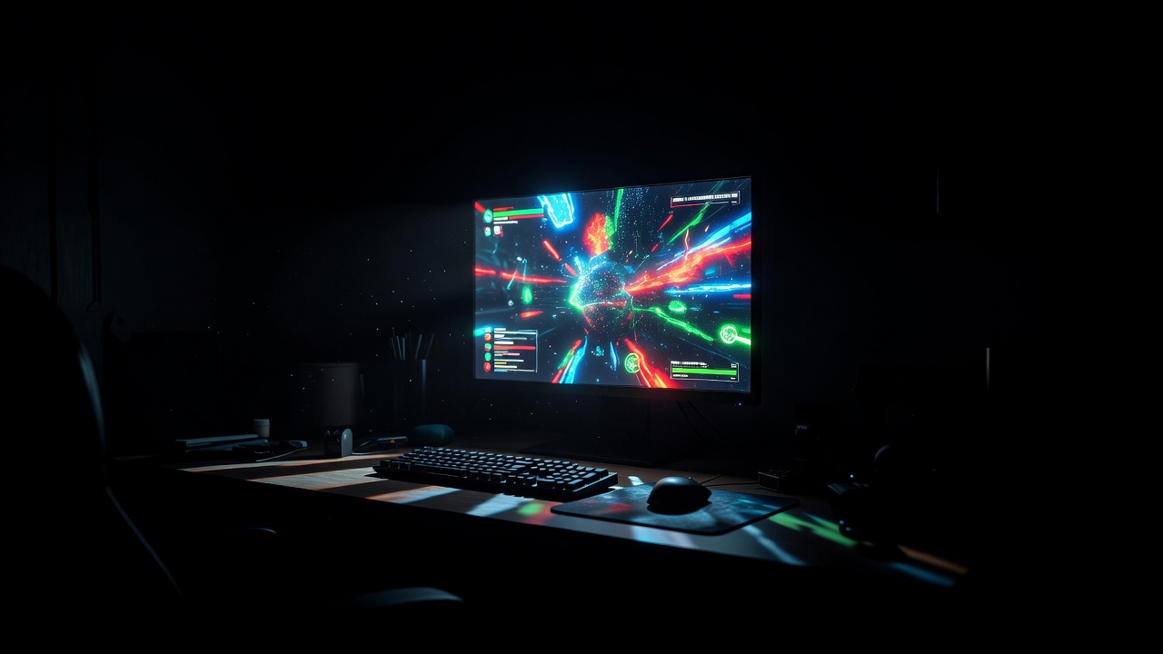
Three ways to put information on screen
Most HUDs fall somewhere between three styles. None is correct by default; each trades immersion against speed of reading. Compare them below.
Diegetic: information inside the world
Health, ammo and maps exist as objects the character could see. Dead Space's health bar running down Isaac Clarke's spine and the ammo counter projected from his weapon are the textbook case; Metroid Prime's visor framing is another. Strength: immersion, no screen clutter. Risk: information moves with the camera and can be hidden by lighting or geometry. Always ship a fallback or a larger-text option.
Minimal: show it only when it matters
Elements fade in when values change or the player is in danger, then fade out. Shadow of the Colossus and many cinematic action games lean this way. Strength: clean frames, strong mood. Risk: players lose track of resources and are surprised by states they could not see. Give a toggle to keep elements permanently visible.
Overlay: a fixed layer on top
Classic bars, counters, mini-maps and ability bars locked to screen positions, common in shooters, MMOs and strategy games. Strength: fastest to read once learned, because positions never move. Risk: clutter and constant contrast fights with the background. Use backing plates, outlines or drop shadows and let players scale and reposition elements.
Legibility checks with minimum sizes
These are the checks we run on every HUD and subtitle system we review. Sizes are given as cap height or font size at 1080p output; scale proportionally for 4K or 720p. They are desk baselines, not platform rules, so always confirm against current platform requirements.
| Check | Minimum | Why it matters |
|---|---|---|
| Body and subtitle text, TV | 28 px font size | Living-room distance shrinks perceived size dramatically. |
| Body text, handheld | 22 px (in 1080p terms) | Small physical screens, closer viewing; still the most common complaint. |
| Critical HUD numbers | 32 px, tabular figures | Read in a glance; digits must not jitter as values change. |
| Text contrast | 4.5:1 against its backing | WCAG baseline; game backgrounds change constantly, so test the worst frame. |
| Subtitle background | Box at 50–100% opacity, player-adjustable | Guarantees contrast over snow, fire and sky alike. |
| Subtitle line length | Around 38–42 characters, max two lines | Shorter lines are scanned faster while listening. |
| Speaker identification | Name label or colour plus name | Players need to know who is talking, without relying on colour alone. |
| On-screen time | Long enough to read twice at speech pace | Fast readers skim; everyone else needs a second pass. |
| Safe area | Critical HUD inside ~90% title-safe | TV overscan and handheld corners can crop edges. |
Where the eye actually goes
Players look at the centre of the screen, near the crosshair or character. Anything in the far corners requires a saccade, a quick jump of the eye, and a moment of re-focus on return. That is why many competitive games pull critical values like health and ammo closer to the centre than older designs did, and why hit markers and damage indicators live near the reticle. Corners are for information you consult, not information you react to.
Subtitles are interface, not an afterthought
Subtitles are the most-read text in many games, and a large share of players switch them on whether or not they are deaf or hard of hearing. The Game Accessibility Guidelines recommend offering subtitles with a readable default size and a background; Ubisoft has published research and talks on subtitle usage that push in the same direction, and broadcast references such as the BBC subtitle guidelines remain valuable for line breaks and timing. Turn subtitles on by default, or ask on first launch, and give options for size, background opacity and speaker names.
Motion, flashing and effects
Text that pulses, shakes or flashes to signal danger is fighting its own job. If something must animate, animate the frame or icon around the number, not the digits themselves, and respect reduced-motion and photosensitivity settings. Screen shake should never apply to the HUD layer.
For how type choices feed into this, read Drawing Glyphs for a Moving Screen. For quick answers, see the FAQ.