Drawing Glyphs for a Moving Screen
A book font is read by someone sitting still. A game font is read by someone dodging. That one difference changes almost every decision a type designer makes.
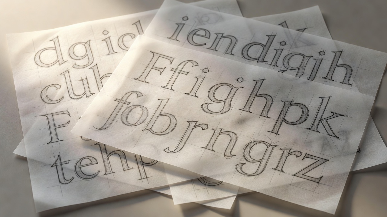
Why game type is its own discipline
On a review call, the first question we ask about any typeface is not "is it beautiful?" but "what is the player doing when they read it?" In a menu, they are at rest and can scan. In combat, they have a fraction of a second, the background is moving, particle effects are crossing the text, and the camera may be shaking. A typeface that looks elegant on a style sheet can collapse into grey mush the moment a explosion blooms behind it.
That is why many studios separate their type into two jobs: a display face that carries the game's personality in logos, chapter titles and splash screens, and a workhorse face that carries numbers, labels, subtitles and tooltips. Halo's long association with squared, technical letterforms in the Eurostile family is a classic example of display type doing identity work, while the dense information underneath relies on far plainer shapes.
Proportions that survive motion
The letter features that matter most for in-play reading are measurable. We check them on every specimen:
- Large x-height. Lowercase letters with a generous x-height stay readable at small pixel sizes because their counters stay open.
- Open apertures. The gaps in c, e, a and s should be wide. Closed apertures fill in when the text is scaled down or blurred by motion.
- Distinct confusables. Capital I, lowercase l and the numeral 1 must not look alike, and neither should 0 and O. In a game with codes, serial numbers or stats, this is not optional. Atkinson Hyperlegible, released by the Braille Institute, is a useful reference for how far designers can push these distinctions without looking odd.
- Tabular figures. Counters, timers and damage numbers should use monospaced digits so they do not jitter horizontally as values change. OpenType exposes these through the
tnumfeature. - Moderate weight. Hairline weights vanish; ultra-black weights clog. A medium or semibold usually wins on screens viewed from a sofa.
Rendering: from bitmaps to distance fields
Early consoles drew text from hand-placed bitmap fonts, one tiny image per character. Pixel fonts still have a place in retro-styled games, but they only look right at integer scales. Most modern engines rasterise outline fonts into a texture atlas at runtime, or use signed distance field (SDF) rendering. The technique was popularised by Valve's Chris Green in a 2007 SIGGRAPH paper on alpha-tested magnification, and it lets one small texture render crisp text at many sizes, with outlines and glows almost for free. Unity's TextMesh Pro made SDF text standard for a generation of indie developers.
The trade-off: plain SDF rounds off sharp corners at large sizes. Multi-channel SDF variants preserve corners better, which matters for angular display faces. Whichever pipeline you use, test the result in the engine, at the real resolution, on the real device. A font that looks perfect in a design tool can render with heavier or thinner stems once the engine's anti-aliasing gets involved.
Character sets and localisation
A font that only covers basic Latin is a font that will be replaced the week localisation starts. Plan coverage against the Unicode Standard from day one: Latin Extended for Polish, Czech and Turkish; Cyrillic for Russian and Ukrainian; Greek; and, if you ship in Asia, Chinese, Japanese and Korean sets that run to thousands of glyphs. Arabic and Hebrew bring right-to-left layout and contextual shaping that a simple bitmap pipeline cannot handle. Families like Google's Noto exist precisely to give designers harmonised coverage across scripts when a custom face cannot stretch that far.
OpenType features carry much of the hidden load: ligatures, contextual alternates, kerning and localised forms. Make sure your engine's text shaper actually applies them, otherwise your carefully kerned display face will ship with gaps.
Licensing before you fall in love
Desktop font licences usually do not cover embedding a font inside a shipped application. Game use typically needs an app or embedding licence, sometimes priced per title or per platform. Check it before the font appears in a trailer. Open-licence families under the SIL Open Font License are a safe default for prototypes and many shipped games alike.
Next, see how these glyphs behave once they are inside a controller-driven menu, or jump to the HUD legibility checks.